

The critical exercise intensity
Fatigue physiology & finding your personal speed/endurance tipping point


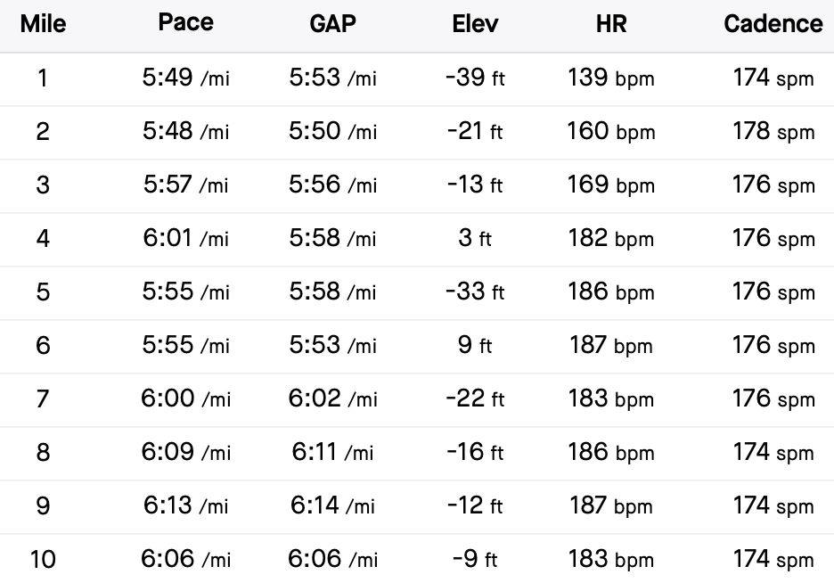
There’s an all too familiar feeling of when you go out for a run, let’s say for an hour, and soon realize the pace that felt good for about 30 minutes quickly turns into pain and suffering. I am no stranger to this myself. If you look at the splits from a 10-mile race I did back in May, I slowed down considerably after mile 7. Nine to 12 seconds per mile slower may not seem like much, but I went from feeling like superman through 6 miles to nearly wanting to quit the race.
General George Patton has a quote that couldn’t be more true: “Fatigue makes cowards of us all”.
Prior to doing this race, I became interested in a concept called critical speed (also called critical power for cycling or rowing). To put it simply, critical speed represents the highest speed you can maintain for about 45-60 minutes. In science terms, it is thought to represent your body’s maximal metabolic rate where energy is predominantly derived through aerobic metabolism.
You might be thinking: “45-60 minutes is a big range, how does that make sense?”. That’s a completely fair point. Critical speed/power is derived mathematically by plotting your best performances on a graph and creating an equation. Pictures help a lot in this case. Let me explain.
Back in the day (1925), A.V. Hill simply plotted world records on a line graph, with speed on the vertical axis and time on the horizontal axis (speed/duration graph):
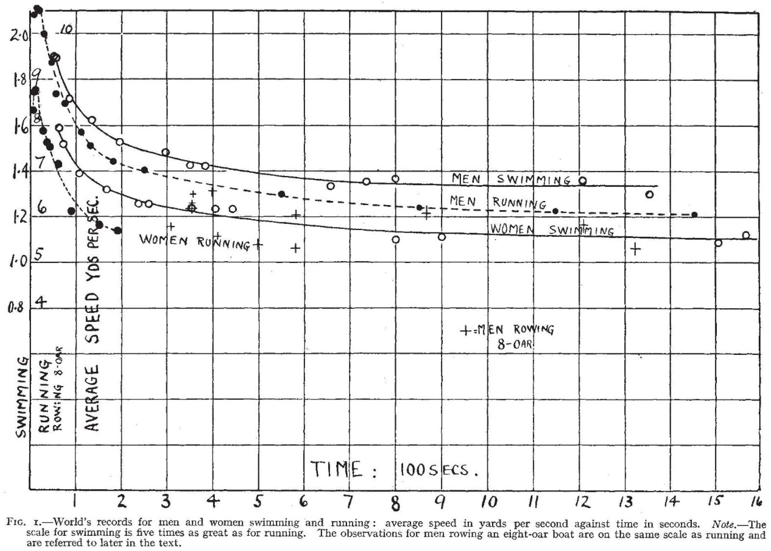
The shape of the line is like a reverse J, also known as a hyperbola, meaning that the sustainable speed for a given race decreases as the distance of the race increases. This of course is intuitive - you can run 400m at a faster speed than you can run 1 mile, you can run 1 mile faster than 3, and so forth. We all know that. This same trend occurs if you plot all the races within a given individual (your own personal bests of various distances), all the best races between individuals (such as current world records from 200m up to the marathon), and works for any type of exercise you can imagine, from running to single joint exercises like bicep curls. It even is found not just in humans but all throughout the animal kingdom, from thoroughbred horses to ghost crabs.
The cool thing about the speed-duration relationship is that it is intuitive, and actually quite a simple concept if you don’t bury yourself in the details. As you can tell from the figure, the line has a sharp downward curve and then flattens out, called an asymptote, meaning that there comes a point where duration keeps increasing but speed doesn’t change much anymore. Think of it like this, the maximum speed you can hold for 1 mile is going to be quite different than what you can hold for 3 miles, but the speed you can hold for 26 miles (marathon) is probably not much different than what you could for 28 miles. Here’s a better example with actual data:
The 400m world record was ran at about 20.7 mph, while the 1500m world record was ran at 16.3 mph, a 24% difference in speed. The half marathon world record was ran at 13.67 mph, while the marathon world record was ran at 13.04 mph, only a 4.7% difference. So adding 1100m between the 400m and 1500m, you slow down 24%, but if you add 13.1 miles (21,100m) between the half marathon and marathon, you only slow down 4%!
It all comes down to energy systems. As you increase the distance, the contribution of aerobic metabolism to energy generation keeps increasing. Even the 800m is something like 60-75% aerobic. There is a drastic difference in the sustainable speed 400m versus 1500m (24%) because there is a bigger relative difference in the energy system contributions (400m: ~40-50% aerobic; 1500m: 75-85%). Above the 1500m it’s basically all aerobic, so the differences in speed you can maintain between longer distances becomes much less.
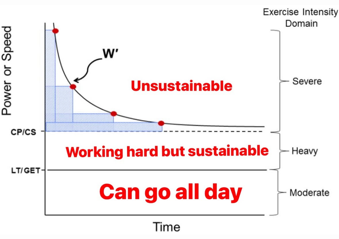
The flattening out of the line on the curve makes physiologists think something important is happening physiologically, which has been confirmed in many experiments. It’s not just something you draw on a graph, the shape of the line represents something going on within our skeletal muscle metabolism and oxygen transport systems. The speed at which the line flattens is your “critical speed” or “critical power”, which is again that maximal sustainable metabolic rate.
As you increase intensity of exercise (walk to jog, jog to run, run to sprint, etc.), things start happening metabolically. Oxygen uptake increases, you start to produce lactate, pH falls, hydrogen ions (H+) and inorganic phosphate (Pi) accumulate (which have a big role in causing fatigue), etc. Critical speed/power is the boundary between when those things are elevated but stable, compared to wildly increasing out of control. Go above the critical power and you start to tap in to finite energy reserves until you exhaust them all and can no longer continue or have to slow down (exhaustion).
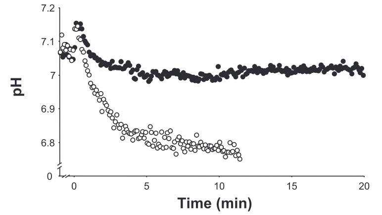
A really interesting study determined people’s critical power then had them exercise (repeated knee extensions) at an intensity just 10% below it and then 10% above it. Their critical power occurred at 20 watts, so 10% below and above critical power was 18 and 22 watts, respectively. Below is a picture showing the quadriceps muscle pH, or acidity, when exercise was below critical power (black dots) and above critical power (white dots). When exercising above critical power, people fatigued in about 11 minutes, while when below the critical power they could continue for the 20 minutes that was asked of them. The fact the intensity only deviated by 10% in either direction but induced such stark differences in metabolism and fatigue shows to me it is a relevant threshold to be mindful of.
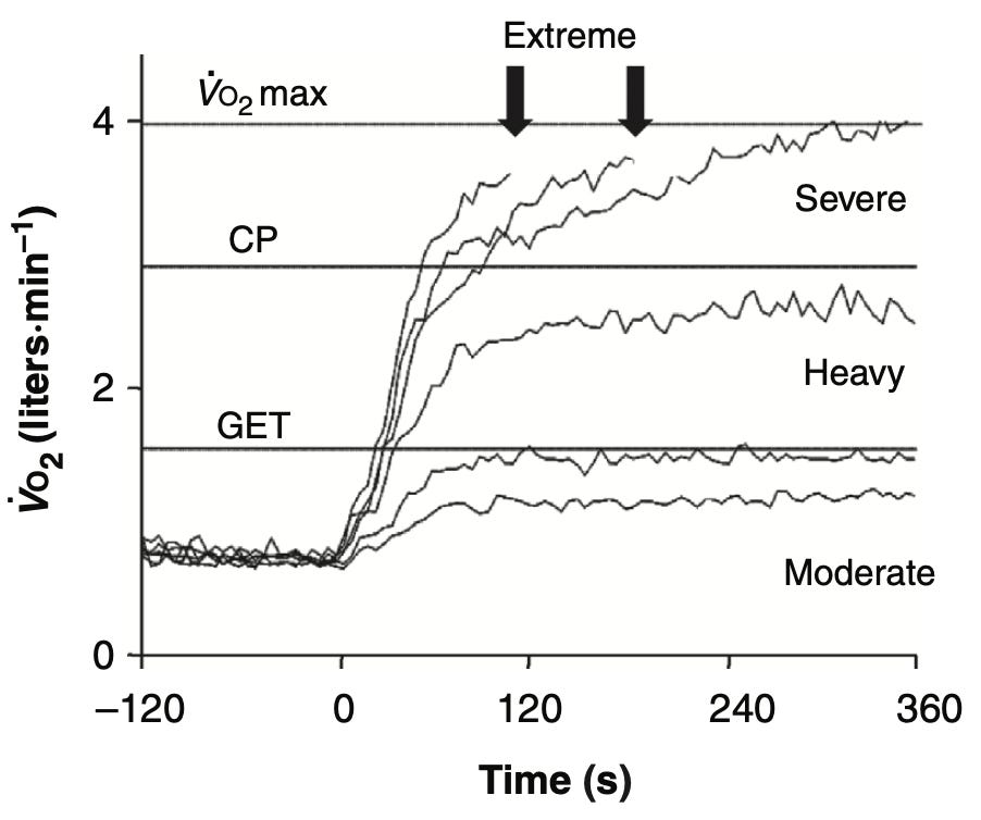
During whole-body exercise, another key feature is how your oxygen uptake (VO2) changes below and above critical power, as seen in the picture below. The jagged lines represent the VO2 when people are cycling at fixed intensities. Instead of zones, this puts exercise intensity into “domains”: 1) moderate, 2) heavy, 3) severe, and 4) extreme.
Moderate is anything below the lactate threshold (LT) or gas exchange threshold (GET), where lactate first starts to rise above baseline or ~2mmol/L, or ventilation first starts increase disproportionately. Heavy is when your above LT/GET and things are much above (VO2, lactate, Pi) or below (pH, PCr) baseline, but stable. Severe is when you go above critical power, VO2 does not stabilize and slowly drifts upwards until you eventually reach your VO2max, and you guessed it, are exhausted and cannot continue. This is when you start to tap into more fast twitch muscle fibers (which cost more oxygen and produce more lactate), body temperature gets higher, and you can no longer compensate for the metabolic challenge, all of which keep driving VO2 higher.
The downside to only knowing critical speed/power is you don’t know the first threshold, your lactate threshold, so won’t know your transition point between moderate and heavy exercise. However, an easy way to approximate this is simply paying attention to your breathing. Start easy and slowly increase intensity until you first notice you’re breathing heavier and it becomes harder to hold a conversation. It may take some time to fine-tune it, but it will get you in the vicinity.
So how do you find out what your critical speed or power is? Basically, all it takes is going out to a track, on an indoor bike, indoor rower, etc. and doing a couple maximal effort time trials. If you compete in races of varying distances, you may be able to grab those times to use. Choose a couple times between 2 and 15 minutes and pretty much just go as far as you can, recording distance and time.
As an example, I used recent times for 600m (1:40), 1 mile (5:10), 2 miles (11:00), and 5km (17:45) for myself. They may not be exactly indicative of my best performances but it’s useful for this example. For running specifically, the easiest method is the distance-time model. Load your data into excel and plot distance over time:
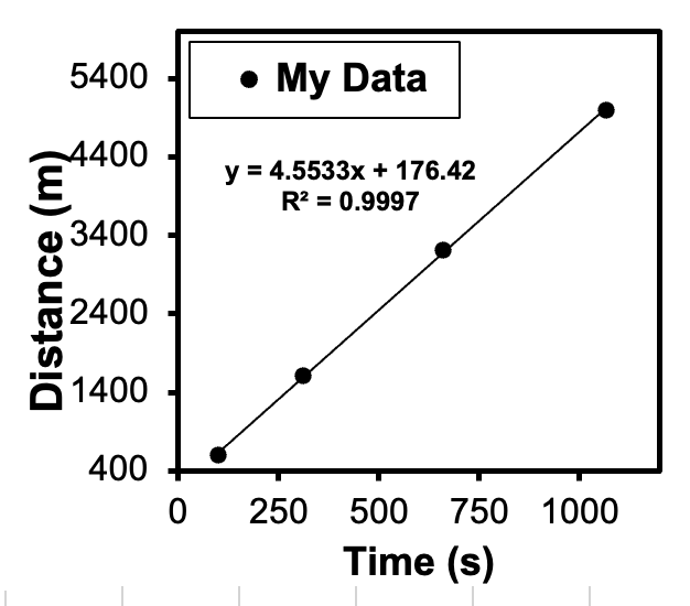
Add a linear regression line and the intercept represents your critical speed (4.55 meters per second, or 10.2 mph). If you’re data doesn’t fall neatly along the line, you may want to re-test. You can also use the speed-duration model similar to the beginning when I was talking about world records:
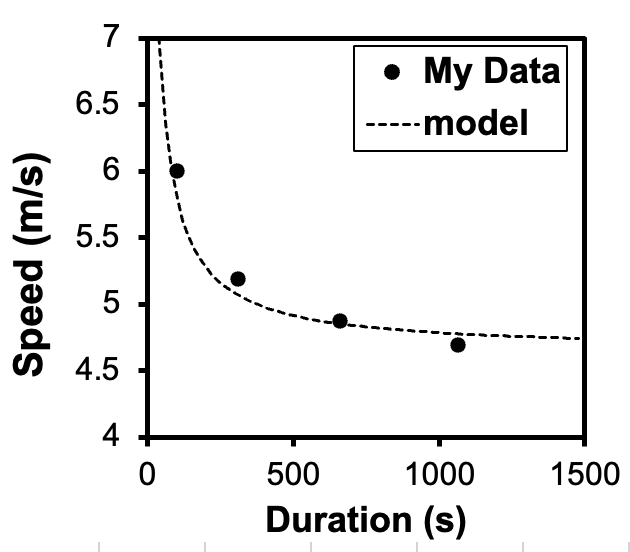
The dots are my speeds over each of durations/distances and the dotted line is the model. The math is a little different for this model, which put my critical speed at 4.65 meters per second or 10.4 mph. To make these graphs and models I used a publicly available spreadsheet from this study and simply plugged in my own data. For those that do not care to see the math behind it, there is an online calculator you can use on the Upside Strength website. All you need is your best time for 1200m (3 laps around a track) and 3600m (9 laps around a track), then it uses the data from this study to calculate your critical speed.
For me, my critical speed spits out to right about what I can run for 1 hour, as noted by my recent 10 mile races. Prior to my previous race in May, it came out to about 9.9 mph, but I wanted to try and break 60:00 anyway, holding just above 10 mph for the duration. My official time was 60:07 (Garmin said 59:53). I think I could have paced it better at the beginning, as I went out~15 seconds faster per mile than my predicted critical speed, which probably led to me hurting around miles 8-9. Maybe I tapped into too may finite energy reserves. My next 10 mile race is in October, so I am using my new and improved predicted critical speed to prescribe my workouts, doing a lot of work at my goal race pace (~5:55 / mile).
Overall, critical speed/power can be a valuable tool to give you an idea for what you’re capable of in certain endurance races and can help take out some of the guess work in your training, to give you a more specified approach. The best part is you do not need any fancy laboratory equipment, just a willingness to suffer for a little bit and push your limits.